 Today Jakob Nielsen published a report concerning improving online donations through better usability: Donation Usability: Increasing Online Giving to Non-profits and Charities. Here are the bare-bone essentials of the report:
When evaluating to donate to your organization, potential donors want to know:
- your mission, goals, objectives, and work
- how you're participating in their community
- do you share their ideals and values
It's important to note this is the shortlist of points people use to evaluate your worthiness. He lays out more points in the paid 124 page report .
What factors turned-off potential donors?
- 47% decided not to donate because of confusing navigation, cluttered design, and/or confusing flow from page to page
- 17% of people couldn't locate the donate button due to 'banner blindness' and 'over-formatting'
- unclear titles and terms along with missing information
- "heinous" integration of local chapters' web presence
What's 'banner blindness' and 'over-formatting?' Banner blindness is the effect where people consciously or unconsciously ignore content on your webpage because it resembles advertising. Again, Nielsen's www.useit.com has an interesting article on banner blindness and how to work around it.
This eye-tracking heatmap shows how people completely ignore content that looks like advertising whether it is or not. The red shows where people looked most often, the grey shows no attention was paid to the area. The green outlined areas were added after to show the areas ignored.
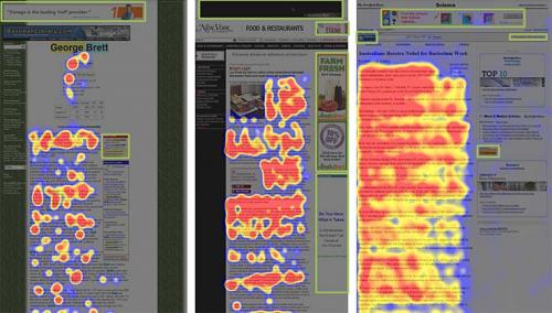
Over-formatting is a similar problem to banner blindness. When content is heavily designed people tend to ignore the content. Studies show the most effective means to attract people's conscious attention are faces, plain text, and cleavage or other private parts of the body.
Once people decided to donate, what were the main stumbling points on donation pages? Well, it seems that most donation pages did "Ok" in his tests. Third party donation vendors created the most suffering for potential donors. However, Nielsen feels that most designers now understand how to make forms fairly intuitive to use. In his opinion, the biggest problem is convincing people to donate.
<rant>Let me speak about the third party vendors for a second. If you've ever worked with any of these 'one-size-fits-all' donation forms you'd probably agree these pages are impossible to convincingly dovetail into a site design. These pages make designers cringe, usability-minded people like me roll my eyes, and the donor's interaction with the donation page-flow at a minimum visually clunky and at a maximum suspicious. How many transactions have been lost to 'every organization gets the same donation form' approach? How hard is it for these million dollar vendors to create some documentation, a test area, and an API so we can create custom donation forms?</rant>
The bullets above cover the content and design issues that stand in the way of people pulling the trigger to donate. Let me summarize Nielsen's conclusions in a sentence:
Design easy-to-use clutter free websites using plain language that answers donors' main questions about your organization's mission, objectives, and values, what they're donating to, and how their donation will be used.
Very standard advise for any website design, but still worth hearing again. If you have $98 USD kicking around, I'm sure the full report will pay itself off (if you follow its advice). Thanks Jakob.